Would you live stream?
The purpose of this project was to take an original ad and critique it under the following catagories: Alignment, Color, Contrast, Proximity, and Repetition. I chose an IRONMAN ad, because I love the camaraderie of IRONMAN.
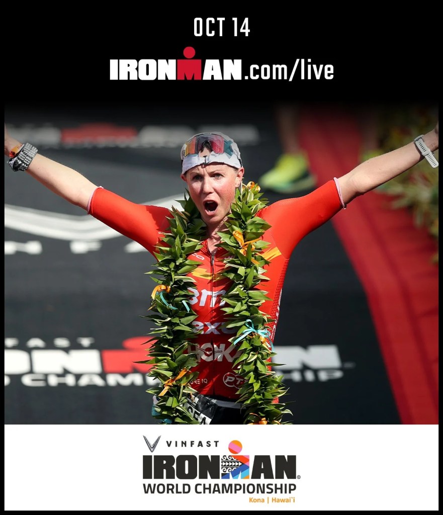
This ad depicts Chelsea Sodaro at the finishing line, as the first female finisher, of the World Championship IRONMAN race in Kona, Hawaii 2022. IRONMAN hired three professional photographers: Hannah Dewitt, Brad Kaminski, and Daniel Wiess to photograph the all day event. Additional photo’s are available thru FinisherPix.
Alignment
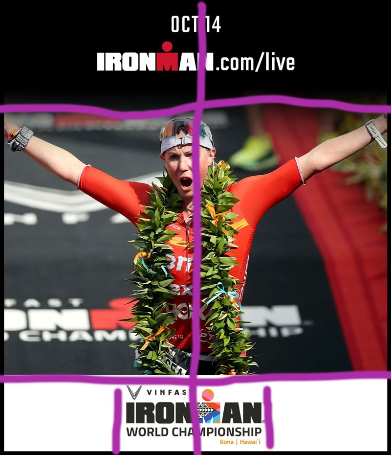
Alignment is centered. The top and bottom sections are aligned diagnolly. Our athlete is centered directly in the middle of the ad. The fonts are vertically aligned; however, the bottom writing is left, justified, and right aligned.
Color
I absolutely love the colors that IRONMAN uses! Although you do not find black and white on a standard color wheel. Red, white, and black accent each other beautifully, always attracted by the eye! Red is worn by our winning athlete, therefore she blends in with the original colors. If the athlete would have been wearing a different color, such as blue, she would have popped out of the advertisement, such as the beautiful green lei.
Contrast
Contrasting an ad for IRONMAN should be simple. IRONMAN uses their legend colors of red, white, and black. The contrast (top/bottom) between white and black, are like night and day.
Proximity
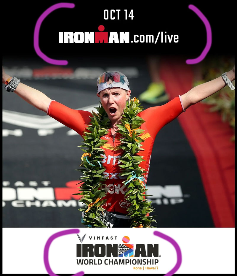
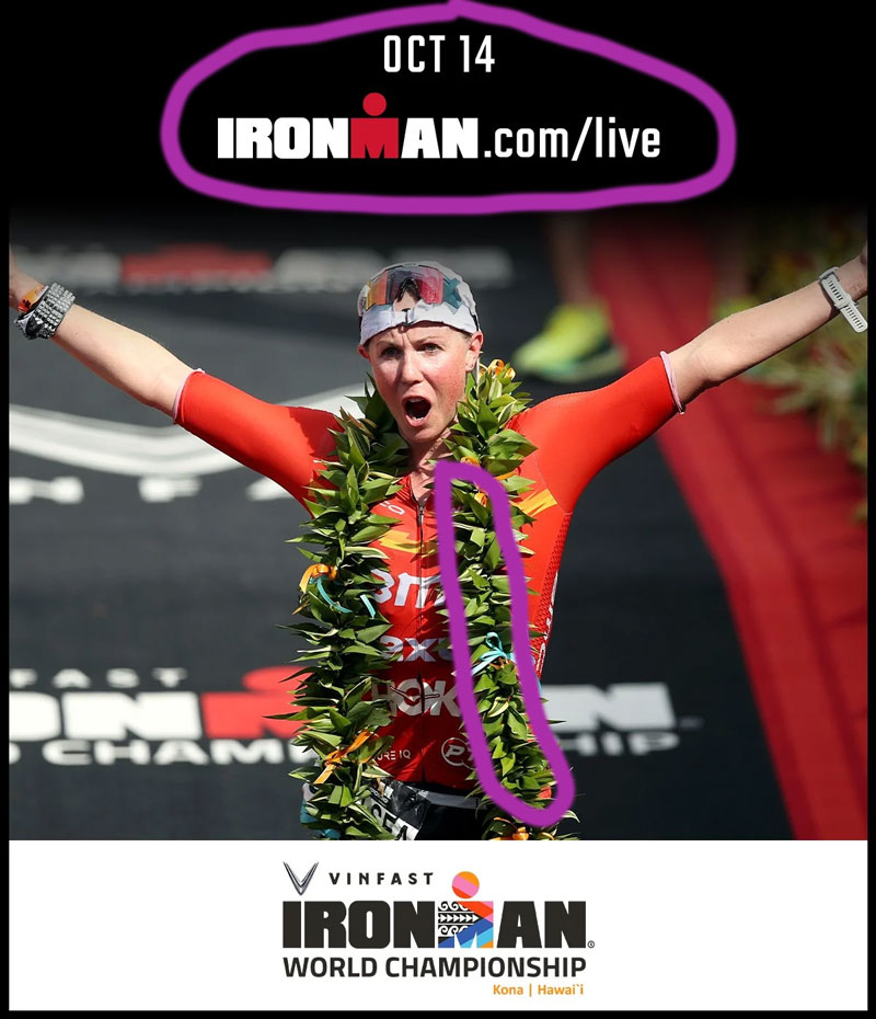
The proximity works in this ad. The related items are near each other. This ad is directed to capture an audience to tune in and watch IRONMAN live on October 14, which is grouped together. I do wish the author would include the year, although, it is assumed. The sponser, Vinfast, is grouped with the event, and location.
Repetition
Repetition is reflected in this ad by using the standard IRONMAN logo, a block “M” with a “circle” on top, known as the “M man”. It is also standard to use “IRONMAN”, as depicted with repetition. In the background (unmarked) you can also see the “M” and parts of “IRONMAN” on a ground runway, finishing mat. If you follow IRONMAN, you would know that the “M man” will change design for every race and location.
Conclusion
IRONMAN produced a beautifully aligned, designed ad! It is has color, which helps with the contrast and repetition. It is eye catching in alignment and proximity. I would click on the link and live stream, but I love all things IRONMAN.

Leave a comment