How would you define it?
The purpose of this project was to take an original piece from a magazine and explain the following catagories: Contrast, Typeface, and Photography. I chose an article I found in a hard copy of the Summer 2023 addition of Country Rustic.
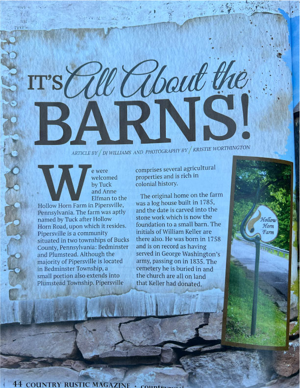
The photographer is Kristie Worthington. I do not know much about her, but in this article, she depicted some beautiful barns and a fabulous sign by illustrating the use of depth of field! You can also view this article and her photography at countryrusticmagazine.com, if you have a subscription. (I do not).
Notice the Contrasts
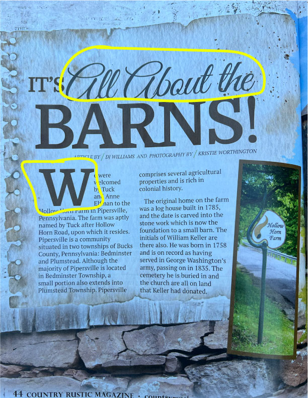
You will find two different contrasting typefaces. The first, as reflected in the cursive and the second is the size of the fonts, you will also notice the difference in line strokes, thick and thin. Contrast is also found in the lighter background, with darker typeface.
Analyze the Typeface
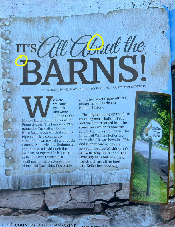
In this article, I have circled two different typefaces. One being slab serif and the other is script. The slab serif has a neutral shape, the letters are block style and bold. They catch attention. The script typeface is curvey, or appear to be handwritten, not necessarily even to reflect the natural flow of a hand. I also want to note that a consistency was used in the type of typography used.
Observe the Photographs

The photograph was taken during the day. You can see the shadows from the trees. The depth of field is reflected by the clarity of the sign and the slightly out of focus trees in the background, this photo defines the proximity of the details in the shot. When I first looked at the photograph, my eyes were drawn to the white sign. The sign is also, in the top third of the photograph.
Would these be great alternatives?
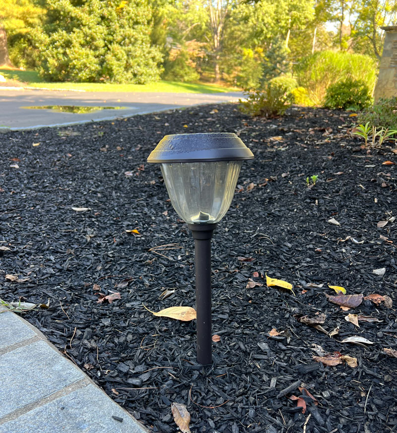
This photograph was taken mid morning, you can see the shadows in the background, which greatly mimic the original photo. The solar light is in full focus, the depth of field is reflected. This photograph would have been better, if I would have cropped off a little of the top, so that the light would be directly in the top third of the photo.

This photograph was taken during the golden evening hours. This is a shallow depth of field. The lamp is in full, sharp focus, and the background is blurred. This photograph does mimic the orignal photo by drawing your eyes to the light. This photo was taken with an iPhone on portrait mode.
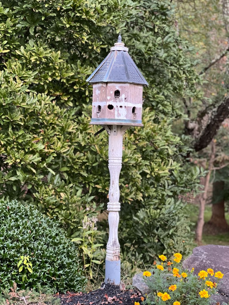
My last photograph was taken during the golden evening hours, with a straight shot iPhone, and no special effects. The birdhouse stands out, the depth of field is shown by the trees in the background, not the focal point, but not completely blurred. My eyes are drawn to the bigger part of the birdhouse, which is located on the top third of the photograph, which mimics the original photograph.
Finding
The typography used by the designer, was well done. They compliment each other with their completely different styles. I also felt like the style they used, fit with the type of article that was written. It was about barns, and barns typically have a bold feel.
The photographers photo, is a photo of depth of field. Depth of field can be described as shallow or deep. Her photograph is a close picture of a sign, it is clear, and the background is not as crisp, but not completely blurred. If I could only pick one, the last photo I suggested, would best fit, as a great replacement for the above article. Not only do your eyes reflect on the top third of the photo, but it also matches the subject of the article. You often find birdhouses near barns.
Several principles were laid out, the color (although the shared original, is off, because it was reshared by taking a photo of a magazine), layout, shapes, and styles used.
Leave a comment