Which to Eat!
The purpose of this assignment was to take an original Ad Campaign and duplicate it; not exactly, but as if it was created at the same time. With an explanation as to what details were used, to give a choice on which ad to run. In my quest, I wondered which sandwhich looked more enticing, which would I eat?

The original ad campaign was created for Burger King by: Anshuman Singh for the purposes of a student assignment for publishing in India and the United States, August, 2023. The ad can be found at:
https://www.adsoftheworld.com/campaigns/by-the-king with all copywrite and art directing credits to Anshuman Singh. The campaign was called, “Of the People, By the King, For the People”.
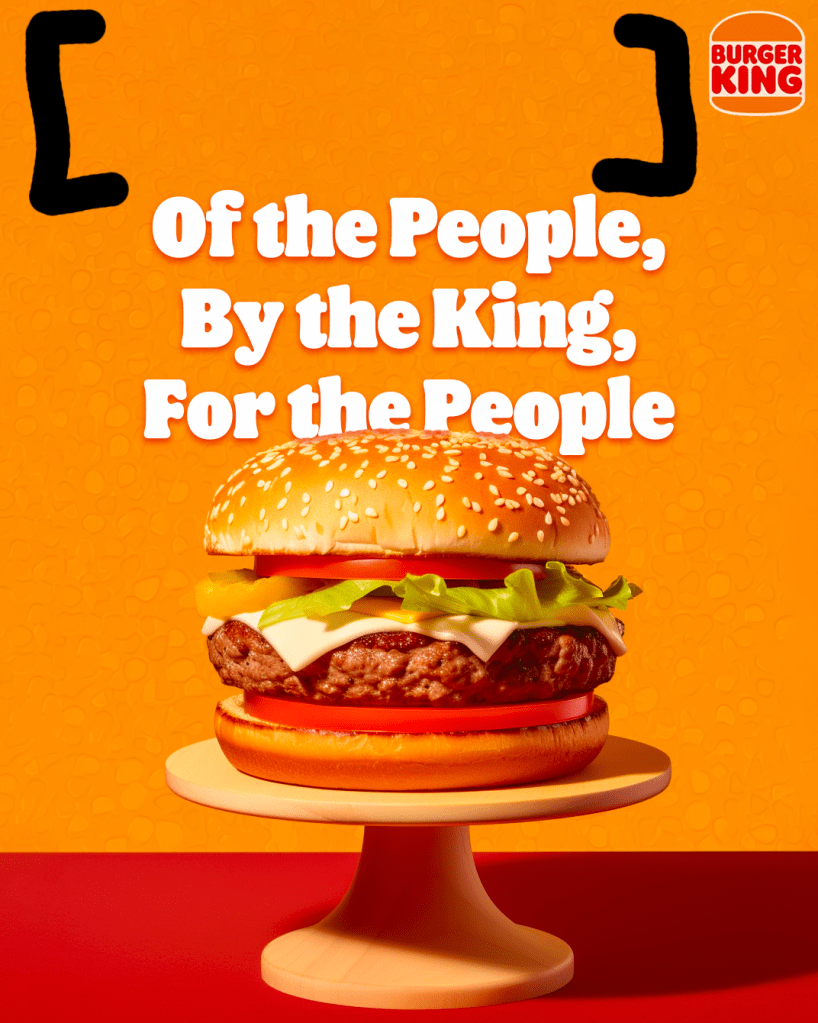
Color
Red, brown, and orange are the primary colors for Burger King, with a touch of green, yellow, and cream white. These colors where chosen in 2021, as a rebranding from the prior color scheme, blue, yellow, and red. The brackets are highlighting, the “water-mark” within the orange color.
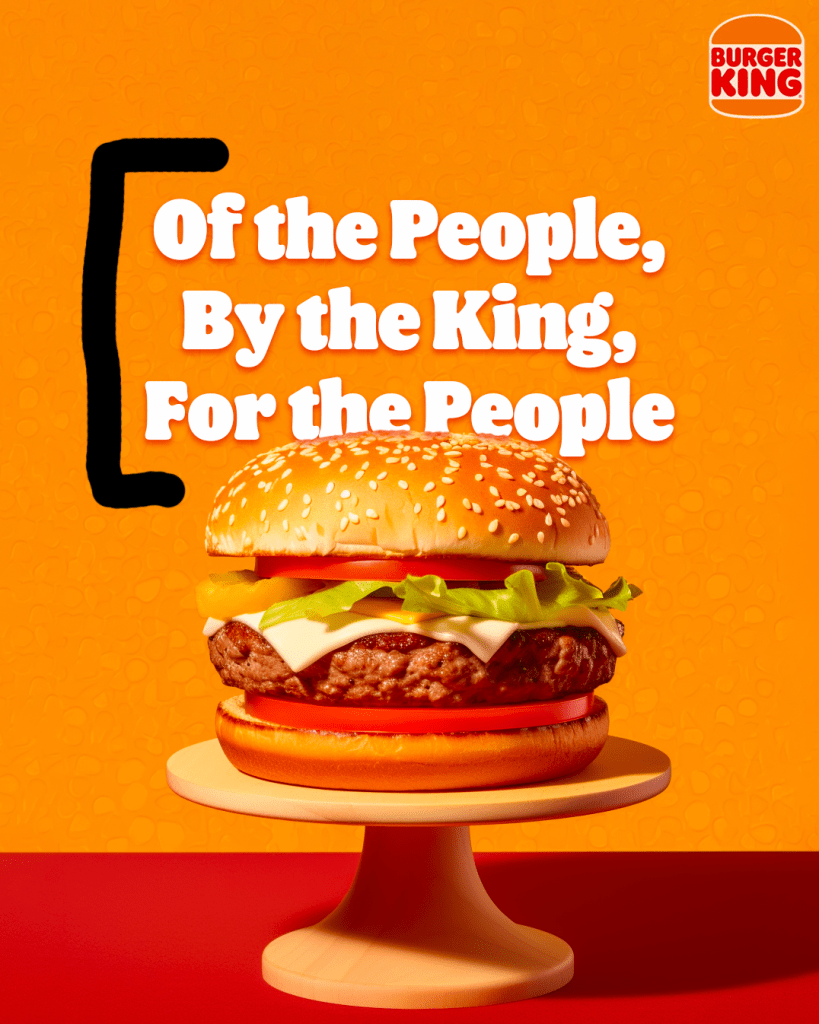
Typography
The Typography in this campaign is original to Burger King, created by Jones Knowles Ritchie. The font is found in the typeface “Flame Sans”. Inspired by the shape of the food.

Design
The layout reflects a centralized look, right down the middle. The Burger King logo is off to the top right, but it is small, although your eyes are drawn to such. I wish I understood why such a space was left above the wording.
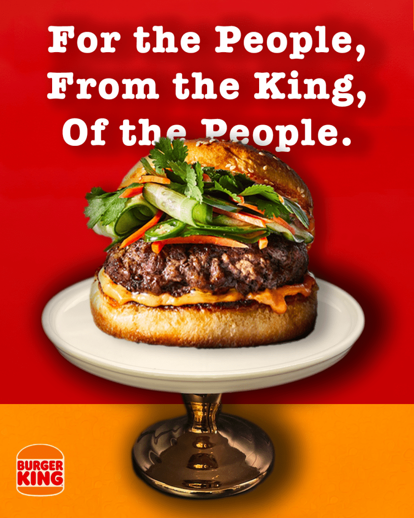
Below you will find my version of the same ad. The picture of the stand was taken by myself (T. Mumford) and the picture of the hamburger was taken from the stock images provided by Microsoft.

Color
Red, Brown and Orange are the colors Burger King uses, and the original ad chose to use the palate of colors designed for Burger King. In my layout I flipped the contrast in colors, with orange being on the bottom and red on the top. Red is often associated with food and Brown and Orange, are warm and friendly.
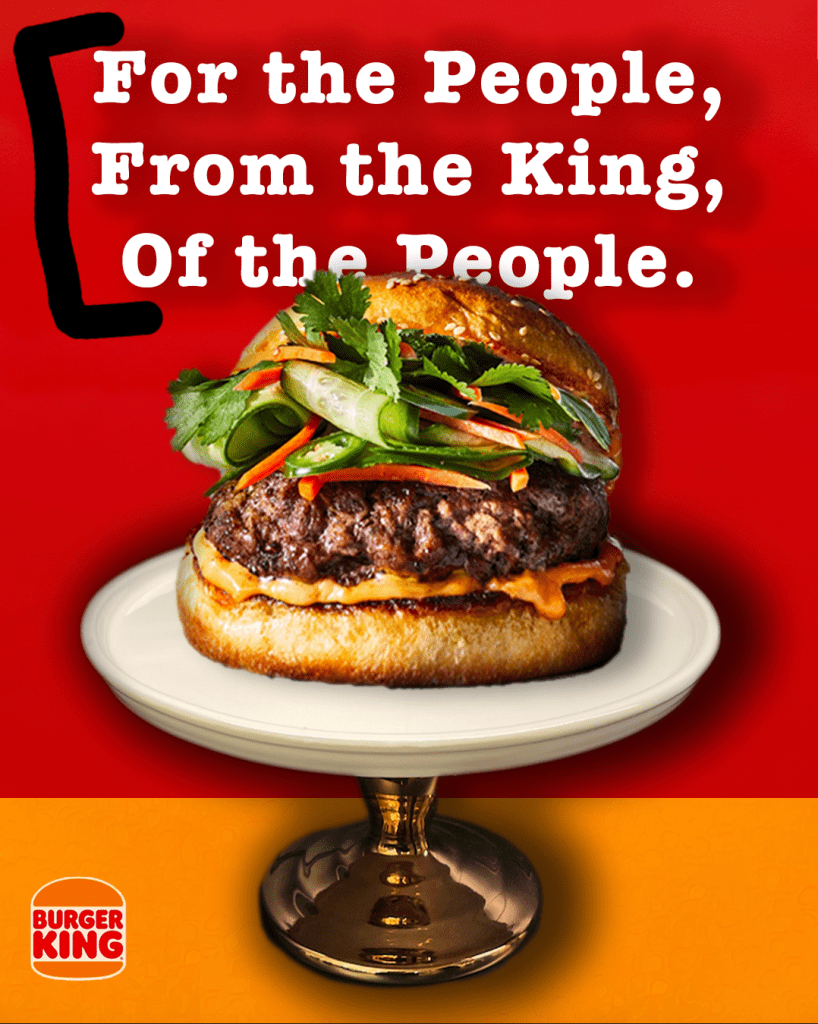
Typography
The original font was designed specifically for Burger King, called the “Flame”. Unfortunately, I did not have access to this font, so I picked the second best. I chose to American Typerwriter, bold, a slab serif with a drop shaddow in white. It is stunning with a twist of the original theme “For the People, From the King, Of the People”.
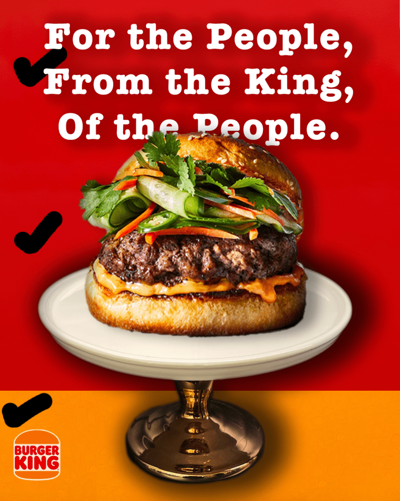
Design
The layout and design is a mimic from the original ad, following the same concept. Different, but the same. The logo was moved to the bottom left hand corner. I chose to use a larger size of font, create a vivid picture, and make my objects bigger with less white space.
Conclusion
The two campaign options are very similar, but work together in their style and layout. The same colors are used, but give two different looks. One being a “plastic” looking burger and the other “realistic”.
I would definately eat my juicy looking hamburger over the original plastic looking one.
Leave a comment